Recently, I presented a group presentation about 'Seeing the text', a journal article written by Stephen A. Bernhardt. I left the classroom with disappointment at myself because I felt that I could have done much better. Sure, this presentation wasn't counted as a real presentation, but still...
Below is the screenshot of my point.

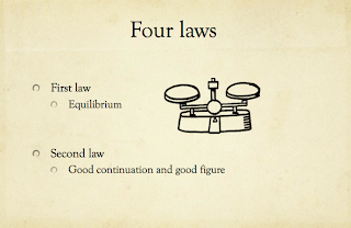
Figure 1.1: Slide#1 that explains about 'Four laws of Gestalt'

Figure 1.2: Slide #2 that explains about 'Four laws of Gestalt'

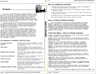
Figure 1.3: Fact sheet of Wetlands
Did you spot my mistake? No? Alright, scroll back up again and compare the figure 1.1 and 1.2. Did you see the error on my title of the slide? I've accidentally insert two different title on the same topic, which is the 'Four laws of Gestalt'. Such error is unacceptable as it may make the audience go, 'Huh? What was that?'
Moving on, yes, graphics do help in not only lightening the atmosphere of the presentation because the audience do not have to read words and words and words on the slide and then lost focus during the presentation (Marquez, 2011); however, it is essential to choose the right graphic to explain the point. For example, please scroll back up again to view the three figures above. Figure 1.1 and 1.2 shows the examples of 'Four laws of Gestalt', I've also inserted two tiny and cute little pictures to explain about the four laws. However, what I did did not help to explain my point because I did not relate to the fact sheet in Figure 1.3. Figure 1.3 is important because it is one of the best example to explain the four laws and it is already provided in the reading. To summarize my long-winded point, I went out of the topic.
To compliment myself, i can say that i have, indeed, did as instructed in the reading by Diana Reep (2006). She mentioned that white space creates a path that will lead the reader throughout the reading of the text. Besides that, Kress, G. & van Leeuwen, T. (2006) mentioned that image turns a boring text into a better record because people no longer read, they scan through the page, and image is able to explain or summarize the text.
Reference:
1) Marquez, Z.L., How to Make A Good Power Point Presentation, http://ezinearticles.com/?How-to-Make-a-Good-PowerPoint-Presentation&id=4313178, viewed 5th May 2011.
2) Kress, G. & van Leeuwen, T. 2006. Reading images. Chapter 1: The semiotic landscape: language and visual communication.
3) Reep, Diana C. 2006, ‘Chp 4: Principles of Document Design,’ in Technical Writing, 6th ed., Pearson Edu, Inc., New York, p.173-190.
Hi Eleena,
ReplyDeleteContent will be even better if:
1. New media postings, eg, blogosphere, new publishing trends have new media concepts/ theories abt. ecosystem/ qualities.
2. Give opinion for community & classification and then cite readings/ materials from scholars on the same issues to support your opinion.
Apart from that: detailed and remember to focus on concepts/ theories for the future postings! :)